

Color choices can make or break an outfit. Knowing what shades are in style gives you a real edge when shopping or putting looks together.
Fashion color trends 2026 are shaping up to be bold, grounded, and full of personality. From soft neutrals to punchy accent tones, there is something for every style this year.
In this post, you will find out which colors are leading the season, what the biggest fashion weeks are showing, and how to wear these shades in real life.
Whether you shop high street or high fashion, these trends are worth knowing.
What Drives Fashion Color Trends Every Year
Color trends do not appear out of thin air. They are shaped by a mix of global events, cultural shifts, and industry forecasting that happens months or even years in advance.
The biggest fashion weeks in New York, London, Milan, and Paris set the tone each season. Designers debut their collections on the runway, and the colors that show up most often across shows become the ones the industry watches.
Pantone and forecasting agencies such as WGSN and Coloro also play a significant role. They study social behavior, art, nature, and global moods to predict which colors will feel right for the coming year.
People’s values show up in color too. Right now, there is a strong pull toward calm, mindful living and a growing care for the planet. That is why nature-inspired tones and soft, soothing shades keep appearing in trend reports year after year.
The Colors Industry Experts Are Backing for 2026
Two of the biggest names in color forecasting have made their picks for 2026, and both point to a year of calm energy and bold expression.
Pantone Color of the Year 2026
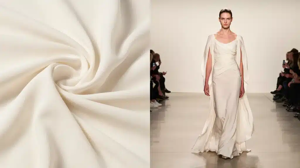
Cloud Dancer (PANTONE 11-4201) is Pantone’s Color of the Year for 2026. It is a billowy, balanced white with a serene, almost weightless quality, described by Pantone as a ‘whisper of calm’ and a sense of peace in a noisy world. It works as a key structural color, giving other shades in a palette room room to stand out.
The shade is meant to bring calm and quiet reflection to a busy, fast-moving world. It pairs naturally with pastels, neutrals, and bold accents without clashing.
WGSN and Coloro Color of the Year 2026
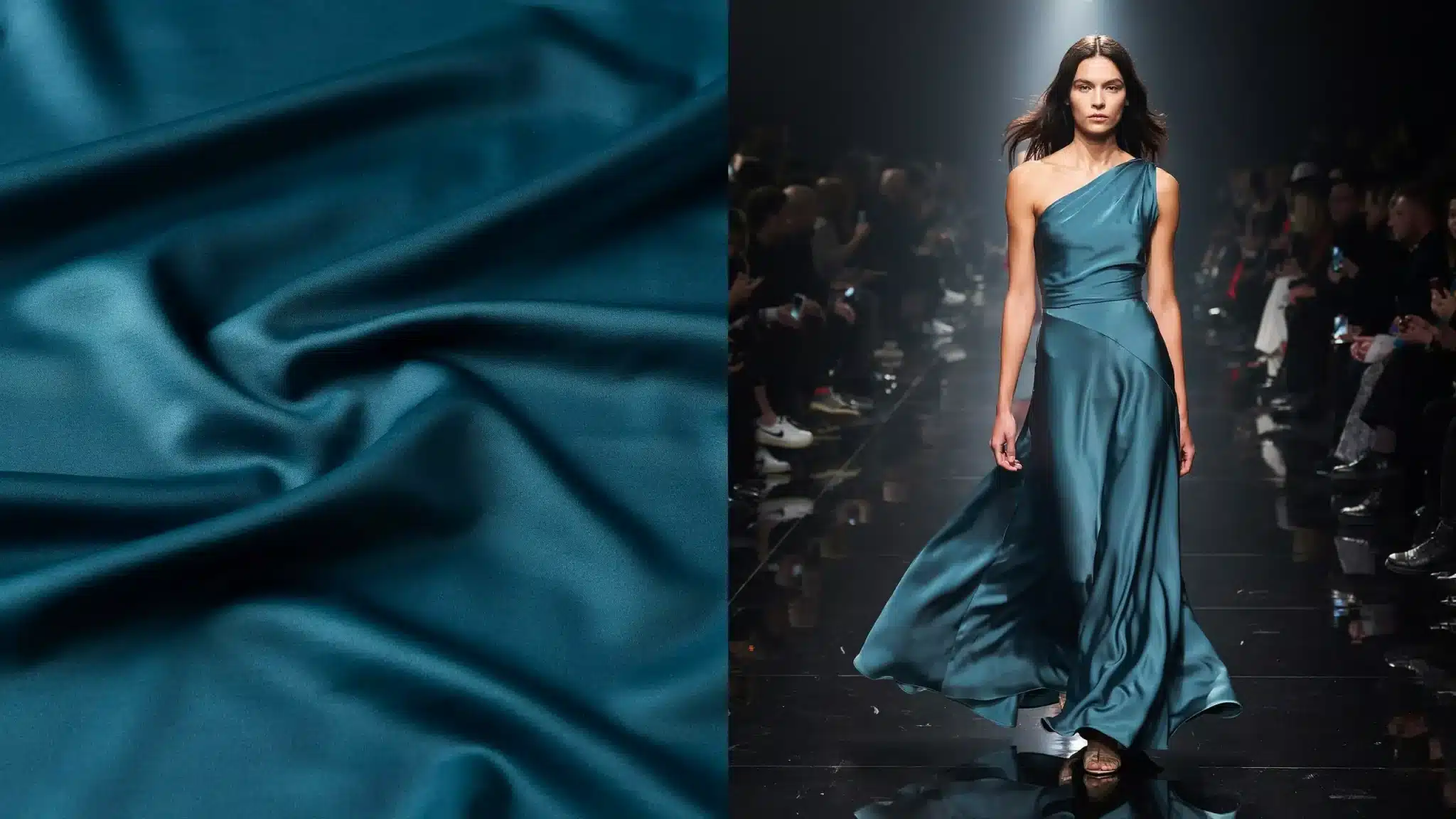
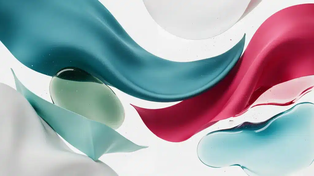
Transformative Teal is the Color of the Year named by WGSN and Coloro for 2026. It is a fluid blend of dark blue and aqua green with a cooling, restorative quality.
Alongside Electric Fuchsia, WGSN and Coloro’s official SS26 accent picks are Blue Aura (a cool blue-gray neutral), Amber Haze (a warm amber-yellow), and Jelly Mint (a clear bright mint green). Electric Fuchsia is gaining ground, especially in the youth market, paired with washed blacks and grays for an edgy finish.
| Chartreuse was one of the breakout colors of the spring/summer 2026 season, confirmed at Tibi, Burberry, Erdem, Simone Rocha, Saint Laurent, Valentino, Balenciaga, and Alaïa, making it one of the most cross-city consensus colors of the season. |
The Must-Know Spring 2026 Colors
Here are the standout shades making the biggest impact this spring season.
1. Alexandrite
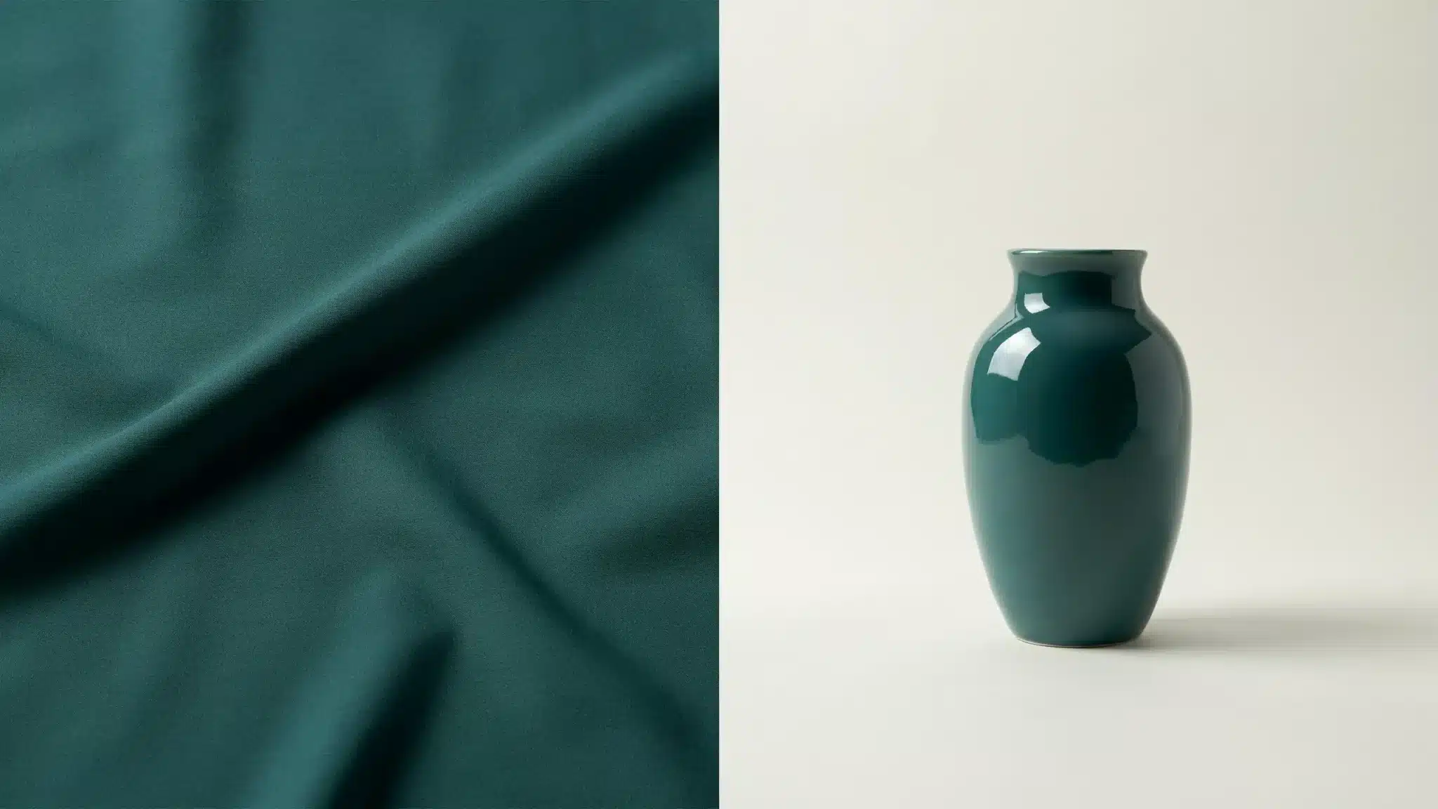
Alexandrite is an intense teal and blue-green shade with an almost mysterious quality. It sits in the maximalist category of the spring palette.
It makes it a strong choice for statement pieces like blazers, midi skirts, and structured bags. It pairs well with White Onyx and Cloud Dancer for a balanced, polished look. This is the first time Pantone has selected a white as its Color of the Year since the program began in 1999.
2. Lava Falls
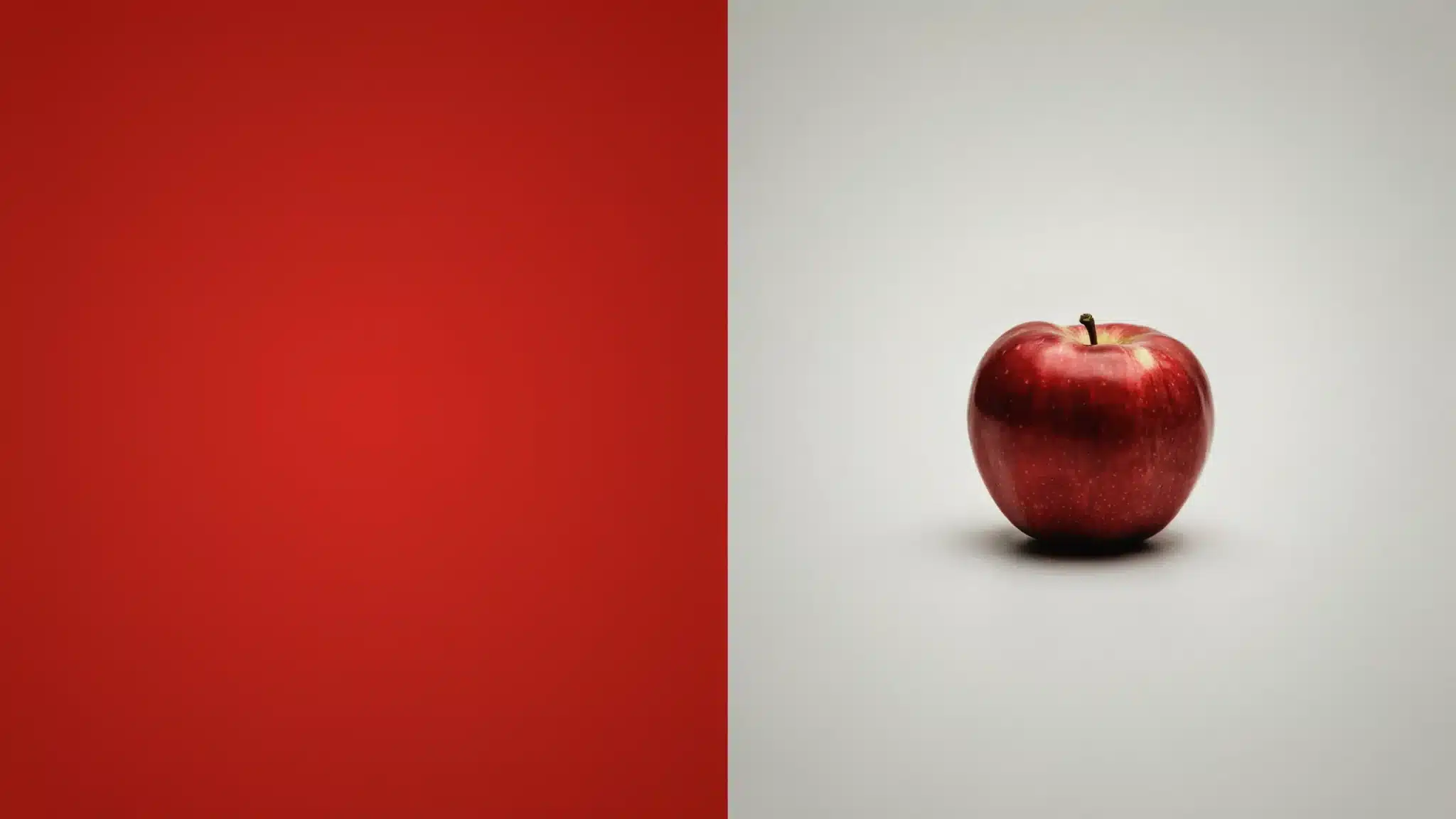
Lava Falls is a bold, dramatic red with deep warmth and intensity. It reads as confident and striking without being harsh.
This shade works best in tailored cuts and outerwear where the color can take center stage. Pair it with neutral bases like Angora or White Onyx to keep the look grounded and wearable.
3. Turquoise
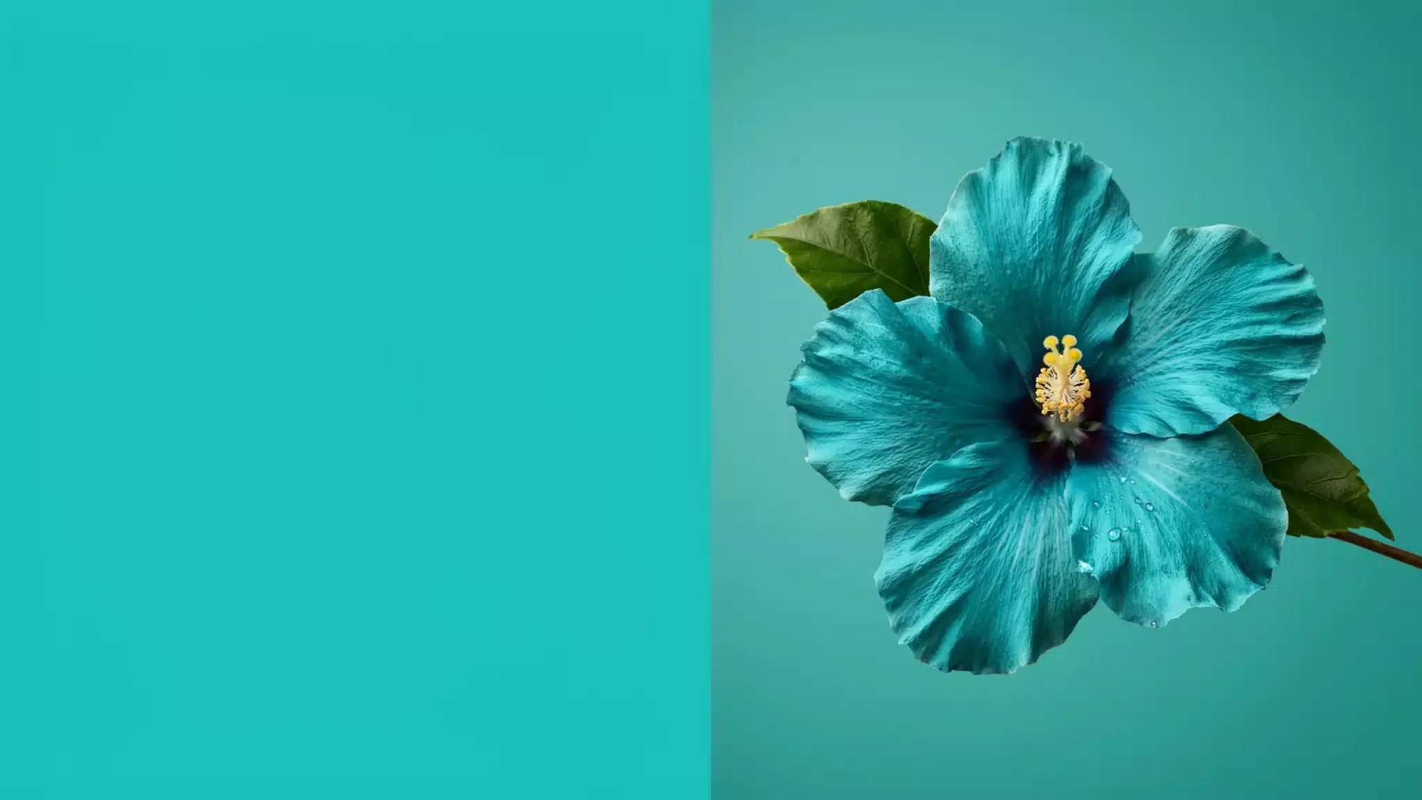
Turquoise is a clear, vivid blue-green that brings a fresh and energetic feel to spring dressing. It sits alongside Fuchsia, Mint, and Aqua as one of the key bright accent colors of the season.
It works well in casual daywear, summer dresses, and accessories, and pairs naturally with white and soft neutral tones.
4. Fuchsia
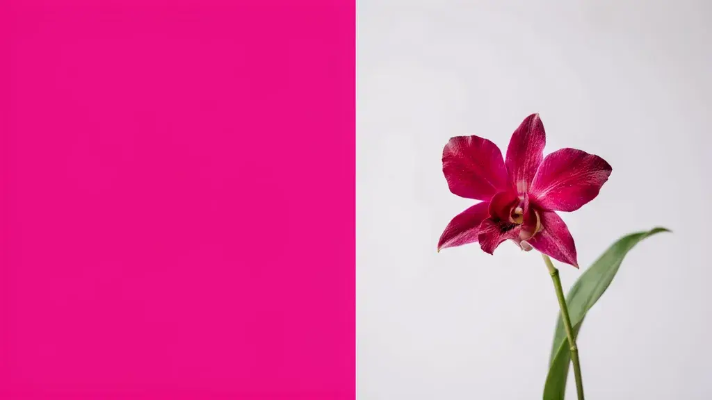
Fuchsia for spring 2026 is a bold evolution of the pink trend, carrying a purple-tinted edge that feels fresh and expressive.
It has strong appeal in the youth market and reads as energetic and confident. Wear it as an accent through shoes, scarves, or bags against a neutral or white base for maximum impact.
5. Mint
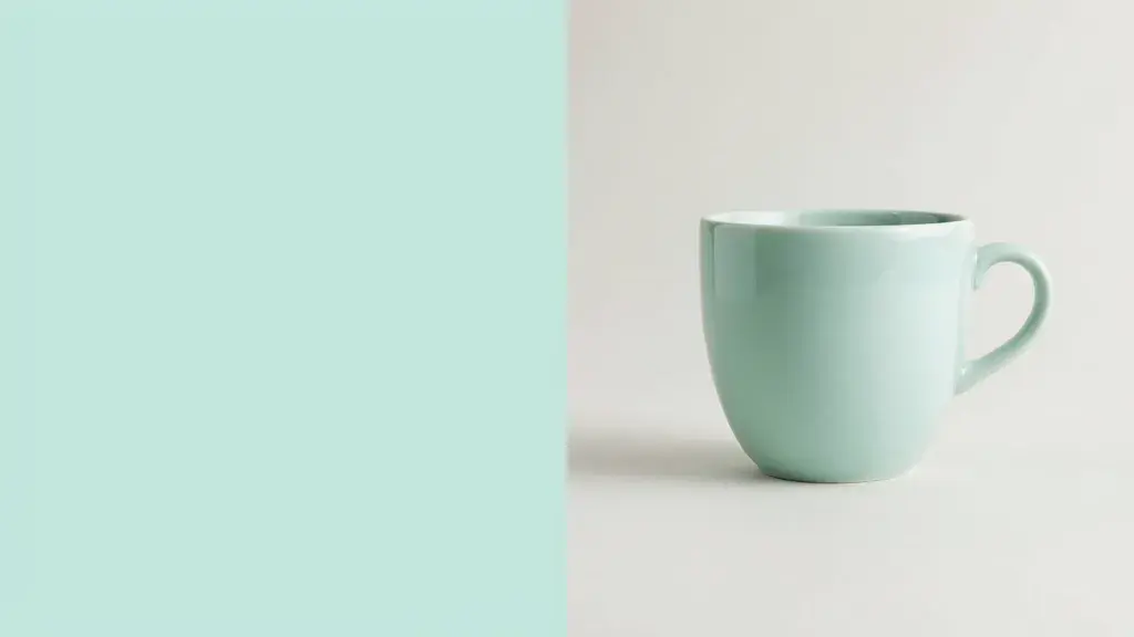
Mint is one of the key accent colors for spring 2026, bringing a playful and youthful energy to the season’s palette.
It is a soft, cool green with a light, airy feel that works well in flowy fabrics and relaxed silhouettes. It pairs cleanly with white, Aqua, and Cloud Dancer for an effortless warm-weather look.
6. Aqua
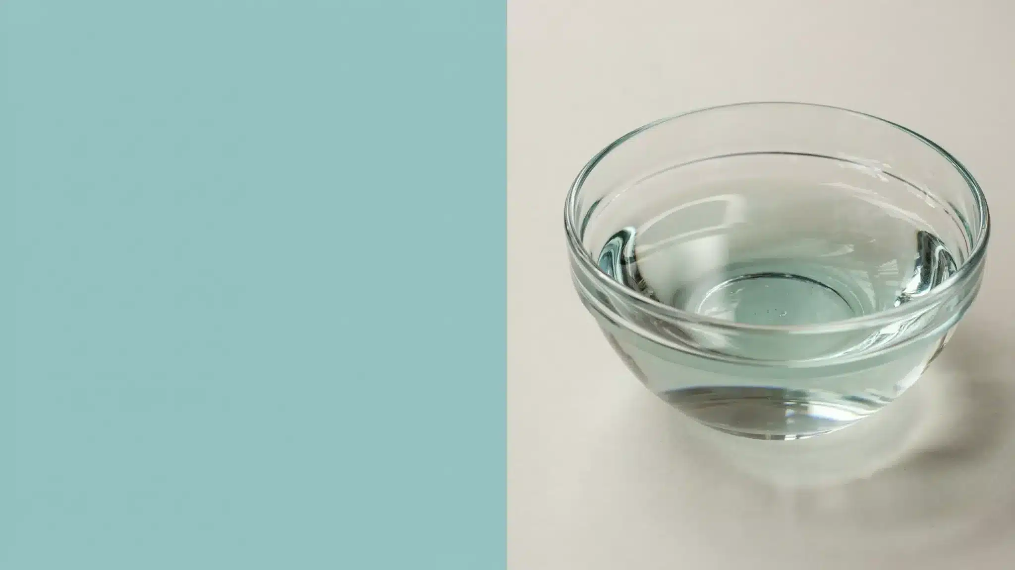
Aqua sits alongside Fuchsia and Mint as one of Coloro’s key accent colors for 2026, bringing freshness and balance to the overall palette.
It is a clear, light blue-green that feels clean and modern. It works across casual and dressed-up looks and pairs well with white, beige, and soft neutral tones.
7. White Onyx
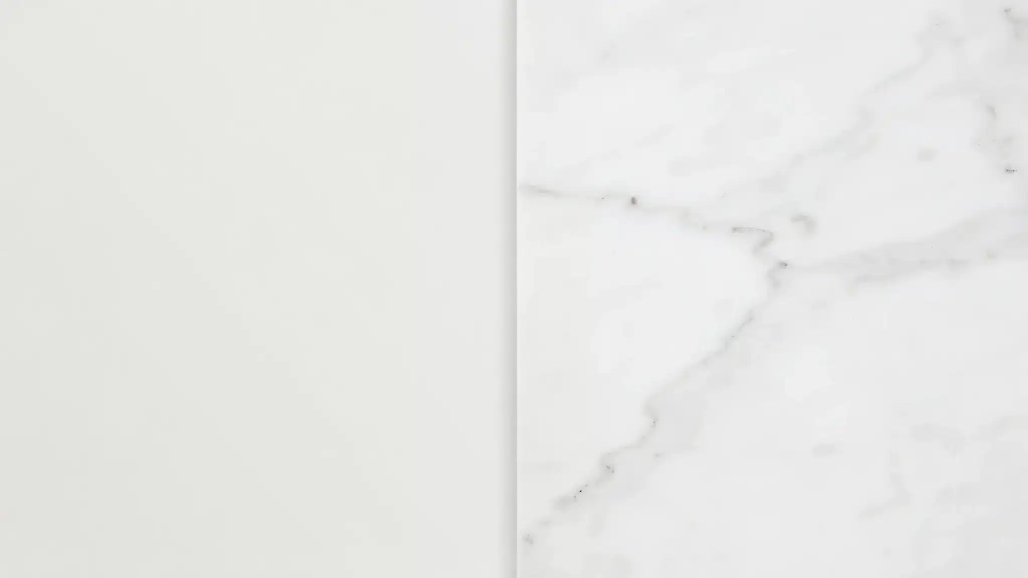
White Onyx is one of six new seasonless shades Pantone identifies as the foundation of the spring 2026 palette.
It is an off-white with a soft, almost ethereal quality that makes it more interesting than a flat white. It works as a base for any bold accent color this season and reads as clean, modern, and refined.
8. Sage Green
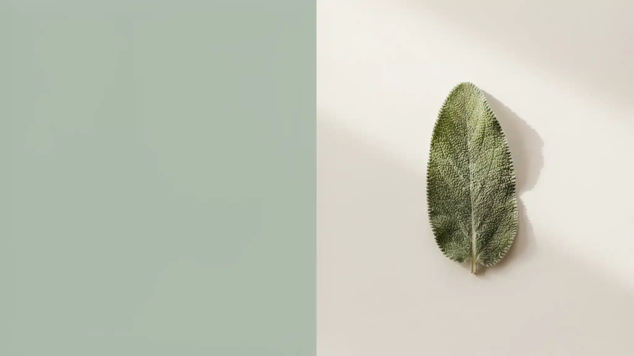
Sage Green is a soft gray-green that feels calm, fresh, and easy to wear across a wide range of skin tones and outfit styles.
It sits in the neutral-leaning category of the spring palette and works well in both casual and polished looks. Pair it with Angora, White Onyx, or Lava Falls for a grounded, nature-inspired outfit.
9. Angora
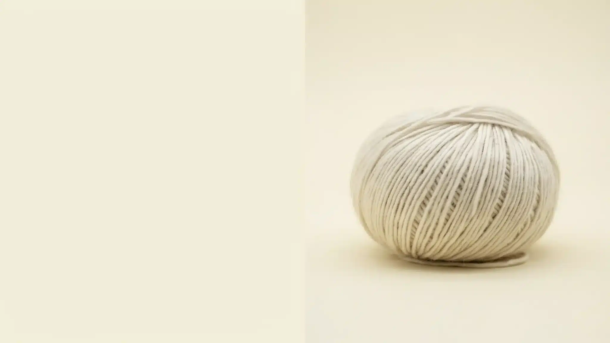
Angora is a pale yellow-beige, light and warm, similar to oatmeal with a quiet hint of sunshine.
It is one of the softest neutrals of the spring season and works as a reliable base for bolder accent shades. It pairs well with Alexandrite, Fuchsia, and Lava Falls, giving any bold color a warm, wearable foundation.
What the Global Runways Showed for Spring 2026
Every major fashion week had its own color story this season. Here is a look at what each city brought to the table for Spring 2026.
New York Fashion Week SS26
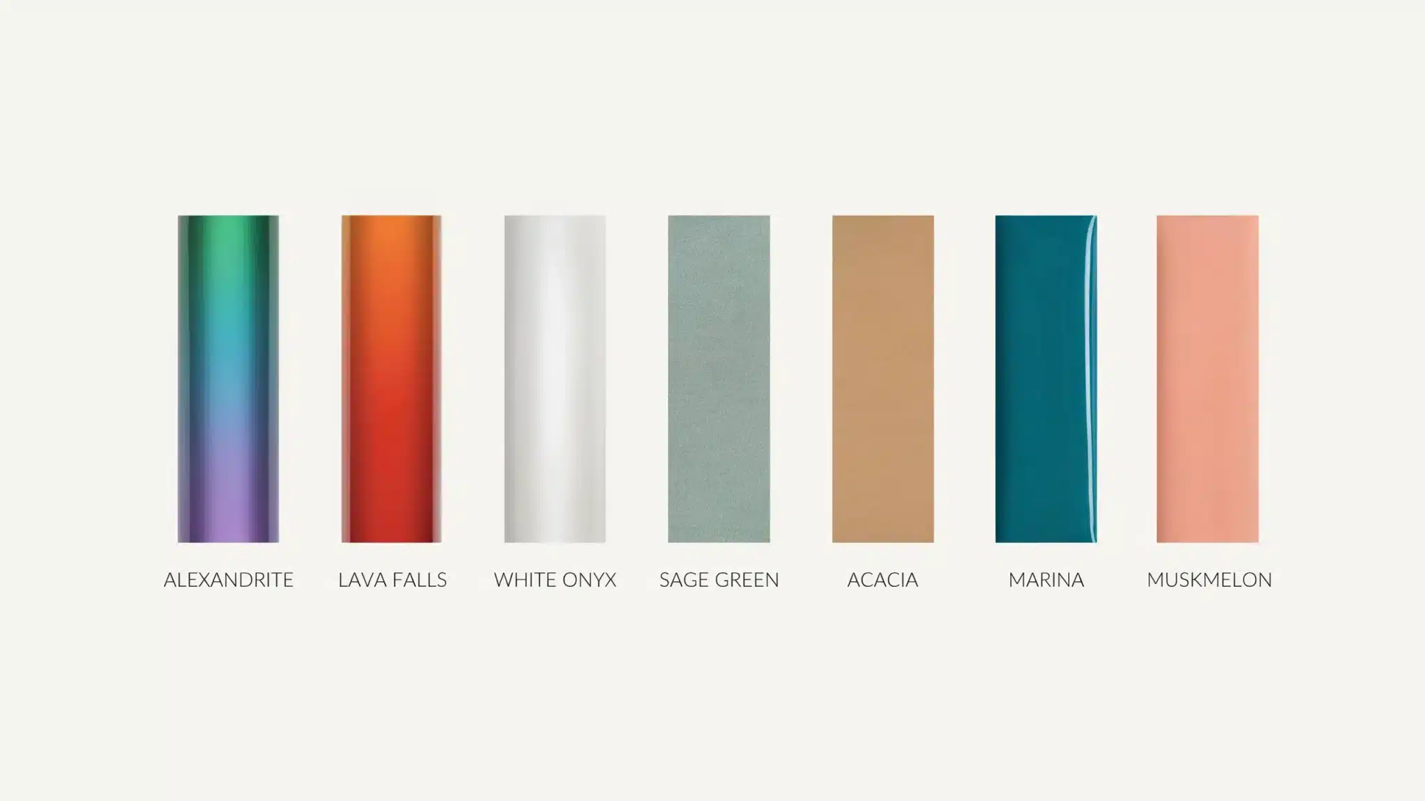
Key shades included the elegant blue-green Alexandrite, the bold red Lava Falls, the clear White Onyx, and the soothing Sage Green.
Additional accent colors included bright yellow-greens, mid-blues, and peachy orange tones, with Tory Burch backing pale blue paired with butter yellow, and Proenza Schouler making a strong case for mint green.
The overall mood was about honest, individual dressing. Bold shades sat next to grounding neutrals, giving people room to put looks together in a way that felt personal rather than trend-led.
London Fashion Week SS26
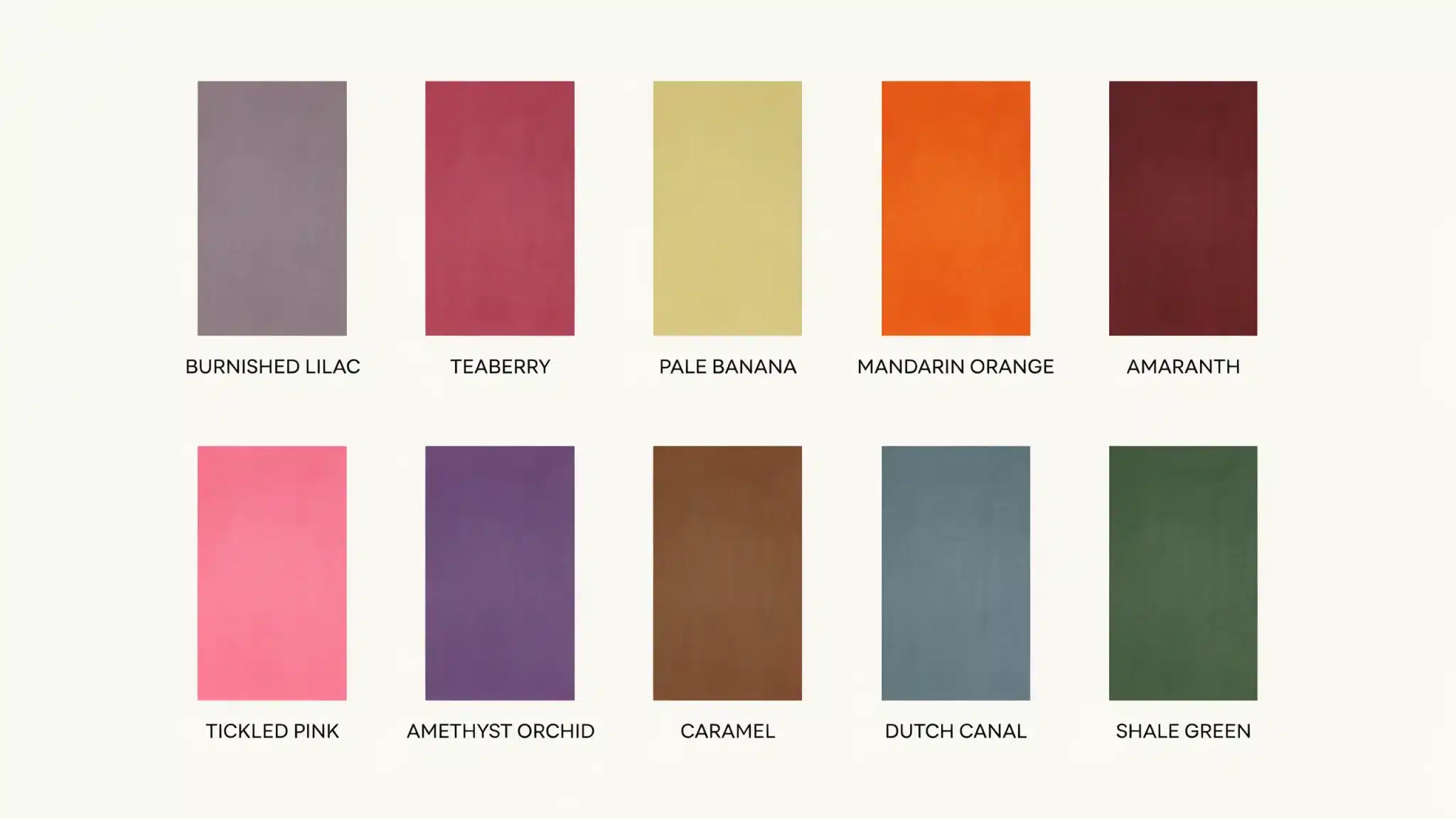
Key colors included Burnished Lilac, Teaberry, Pale Banana, Mandarin Orange, Amaranth, Tickled Pink, Amethyst Orchid, Caramel, Dutch Canal, and Shale Green.
Burnished Lilac brought a smoky lavender with vintage appeal, while Pale Banana radiated optimism and Mandarin Orange lifted the mood with its fruity brightness.
Overall, London Fashion Week focused on modernized classics with a playful touch, balancing cross-seasonal neutral tones with bold, mood-boosting brights.
| Milan was dominated by cobalt blue, confirmed at Loewe, Givenchy, and Bottega Veneta, alongside orange at Prada, No.21, Moschino, and Alberta Ferretti. Paris extended the chartreuse story, with Saint Laurent, Valentino, Balenciaga, and Alaïa all backing the shade. Rich mahogany and pale blue ran as quieter threads through both cities. |
What Colors to Wear This Fall and Winter 2026
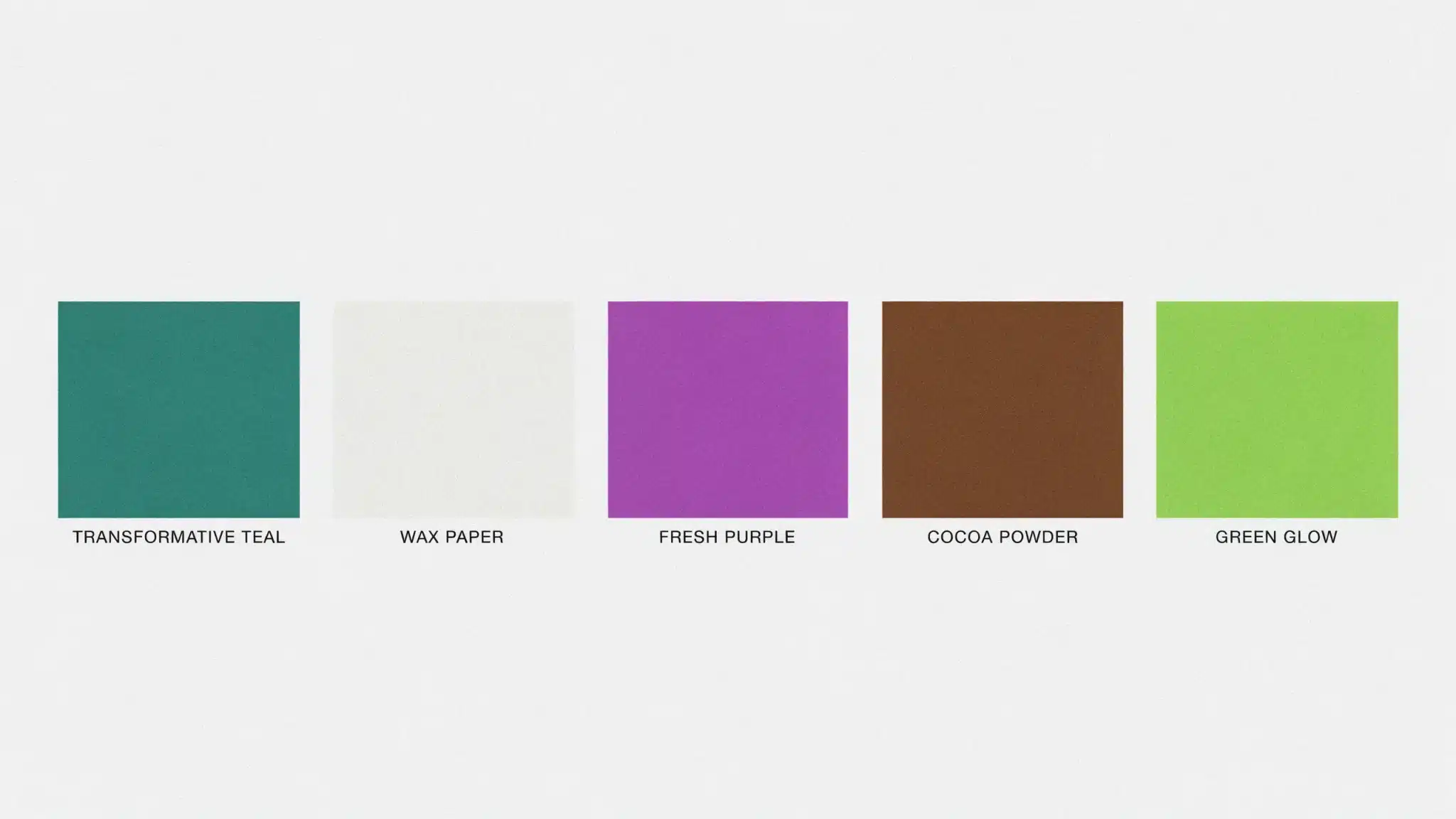
Fall and winter 2026 go deeper and richer with five key colors from WGSN and Coloro.
- Transformative Teal: A fluid blue-green and a versatile dark alternative to black for both casual and occasion dressing.
- Wax Paper: A creamy off-white near-neutral with a soothing character, making it the season’s go-to new neutral.
- Fresh Purple: A royalty-linked expressive accent shade with hints of mystery and spirituality.
- Cocoa Powder: A rich chocolate brown that anchors the palette with warmth and depth.
- Green Glow: A bright yellow-green with a fluorescent edge for a bold, futuristic statement.
Use Cocoa Powder or Wax Paper as your base and bring in Fresh Purple or Green Glow through knitwear or accessories to keep the look current.
How to Style 2026 Colors in Real Life
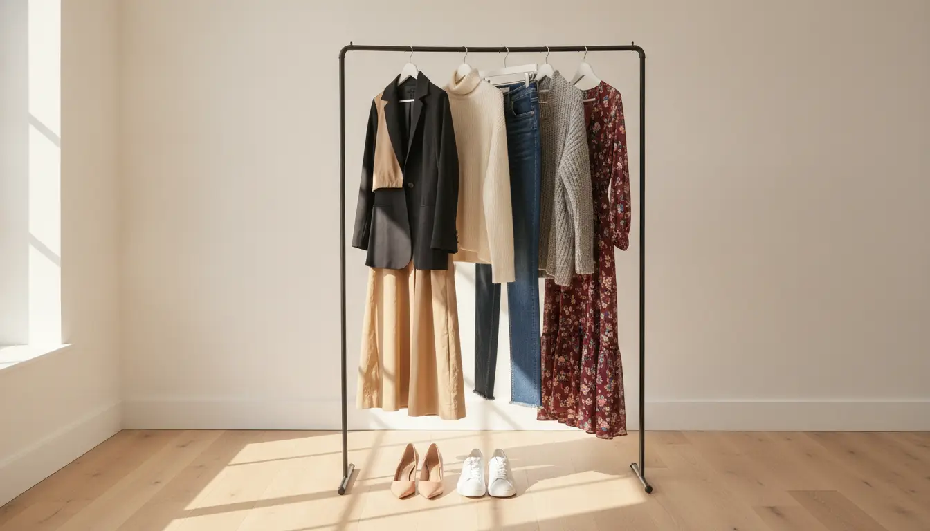
Getting the pairings right makes any outfit feel intentional. Here is a quick guide to the best combinations and how to wear them.
| Color Combination | Vibe | Best Worn As |
|---|---|---|
| Alexandrite + White Onyx | Bold meets clean | Structured blazer over neutral trousers |
| Lava Falls + Angora | Warm and grounded | Statement top with soft neutral bottoms |
| Lavender + Pale Banana | Soft and fresh | Flowy spring fabrics and relaxed silhouettes |
| Cobalt + Sage Green | Modern and nature-inspired | Casual daywear and weekend outfits |
| Coral + Cloud Dancer | Warm and clean | Summer dressing and light layering |
| Cocoa Powder + Wax Paper | Quiet and considered | Tonal fall outfits head to toe |
| Transformative Teal + Green Glow | Bold and high contrast | Statement pieces or accent accessories |
| Fresh Purple + Cocoa Powder | Rich and expressive | Evening looks and occasion dressing |
Pick one statement shade and build the rest of the outfit around a neutral for a look that always feels put together.
Materials and Textures That Make 2026 Colors Stand Out
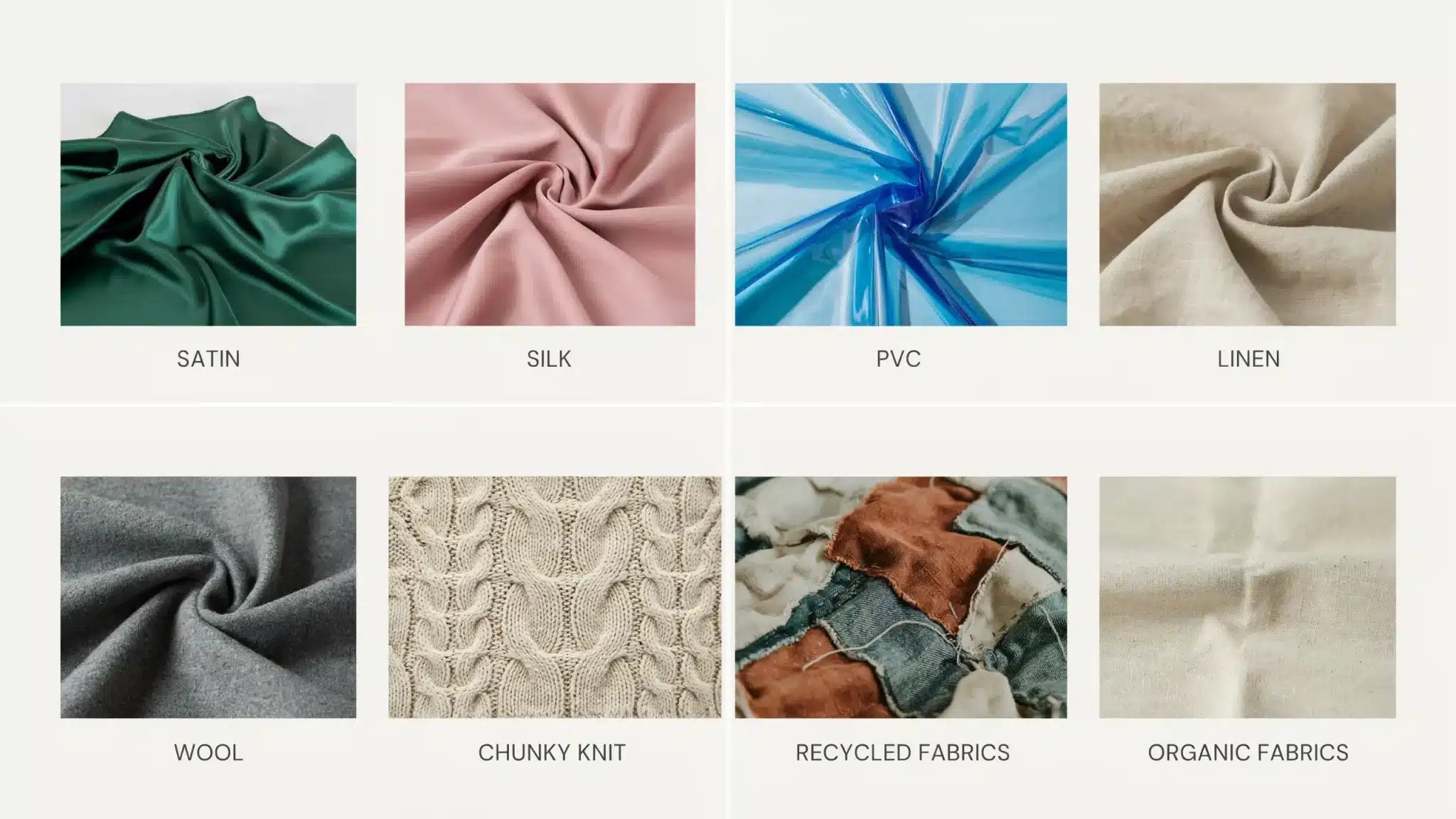
Glossy and transparent fabrics like satin, silk, and PVC intensify bold shades like Alexandrite, Lava Falls, and Electric Fuchsia, making accent colors feel more striking and intentional.
Natural textures like linen and wool work best with earthy tones like Cocoa Powder, Angora, and Wax Paper, giving them a warm, considered quality that feels anything but flat.
Chunky knits carry fall shades like Fresh Purple, Transformative Teal, and Green Glow well, adding visual interest without needing extra styling effort.
Recycled and sustainable fabrics are a natural fit for the nature-inspired side of the palette. Earthy tones like Sage Green and Cocoa Powder sit especially well on organic materials, aligning with the conscious-dressing shift shaping fashion right now.
Let the fabric do half the work. Light, airy materials belong with spring brights, and heavier matte textures are what fall shades were made for.
How Brands Can Leverage 2026 Color Trends
The brands getting color right in 2026 are the ones treating it as a strategy, not an afterthought.
- Use Cloud Dancer as a base across collections and branding to give bolder accent shades more room to stand out.
- Pair Cocoa Powder, Caramel, and Angora with premium materials to signal quality and comfort in the quiet luxury space.
- Use Electric Fuchsia, Lava Falls, and Mandarin Orange in campaigns and statement pieces to drive energy and optimism.
- Bring Transformative Teal into sustainability-focused collections and packaging to convey a credible, planet-first message.
- Pair Sage Green and Wax Paper with recycled or organic fabrics for an eco-conscious brand identity that feels natural.
- Match accent colors to the collection’s emotional tone. Brights energize, soft neutrals calm, and deep shades add depth.
Color is one of the fastest ways a brand communicates its values. Get the palette right, and the collection speaks for itself.
Conclusion
Fashion color trends for 2026 offer more options than any recent season. Whether you lean toward bold spring accents or grounded fall tones, there is a shade that fits your style and your wardrobe.
Start small. Pick one or two colors from this year’s forecast, try them through an accessory or a single piece, and build from there. You do not need to overhaul everything at once to look current.
Bookmark this page and come back as the seasons change. And if you found this helpful, share it with someone who loves fashion as much as you do.
Frequently Asked Questions
Is Cloud Dancer the Same as Plain White?
No, it has equal warm and cool undertones, making it softer and more refined than a flat, bright white.
Which 2026 Color Works Best for Office Wear?
Sage Green, Angora, and Dutch Canal sit between neutral and expressive without being too bold for a professional setting.
Are 2026 Fashion Colors Suitable for All Skin Tones?
Yes, the palette is broad enough to flatter all skin tones, from warm neutrals like Angora to jewel tones like Amethyst Orchid.
Will the 2026 Color Trends Work for Men’s Fashion Too?
Yes, shades like Transformative Teal, Sage Green, Cocoa Powder, and Cloud Dancer work well in menswear too.